
Author : Aidan Chopra, SketchUp Evangelist
A brand new brand for SketchUp
Glance at the masthead of this blog and you'll know something's up. Our new graphic identity is only the most obvious of the changes we've made in SketchUp 8 M4. It's unusual for us to do four maintenance releases between major versions, but then, it's been a bit of an unusual year, hasn't it?
Our move to Trimble gave us an opportunity (and an imperative) to finally build a proper graphic identity for SketchUp. In many ways, this was one of my favorite short-term benefits of the acquisition; it always irked me that our tool, which is so good at making pictures, had a logo that consisted of its name typed out in a particular font. Blech.
Devoted students of SketchUp history (sketchupologists?) will recall that until March of 2006, our logo looked like this:
This kind of logo is known as a logotype or wordmark, meaning that there's no symbol attached to the word; the word is the logo. The trouble with using a logotype for a piece of software is that, most of the time, individual programs on your computer are represented by application icons that live on your desktop or in a strip along the bottom of your screen. SketchUp's icons have looked like this over the years:
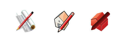
SketchUp's application icons have, in my opinion, gotten progressively less good over the years. The last one (on the right) only appeared on Google's More > Even more page. None of these icons were ever really used as product logos.
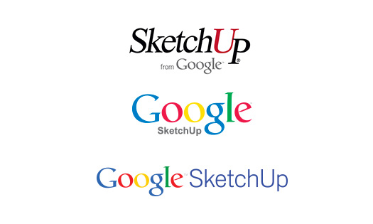
The Google years brought several logos as we responded to successive top-down branding directives. None were particularly inspired, and none solved the we-need-an-icon problem, either.
As we kicked off our new branding effort in June, we were determined to kill two birds with one stone: We would design a symbol (some people call it a "mark") that would do double duty as our product icon.
For the mark/icon itself, we were looking for a form that communicated a number of things. Less important were notions of informality and simplicity, though we obviously didn't want our symbol to convey stodginess or head-banging complexity. We focused on the notions of three-dimensionality, dynamism (movement) and perspective.
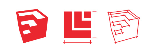
When we saw the sketch of the shape that would eventually become our icon, we knew we were on the right track. It's derived from a cube—which is the go-to symbol of 3D for apps like ours—but it isn't really a cube at all. The implied stairs or levels are an apt representation of our roots in architecture and other construction disciplines.
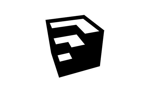
If you look closely, you'll notice the chevrons formed by the top surfaces even point "Up" in a nod to our signature tool.
Whereas application icons are often very colorful—with lots of fine detail, gradients and shading—corporate marks need to be much more flexible. They need to be able to scale up and down without looking smudgy or oafish; they need to be able to printed in a single color when necessary; they need to be readable on black, white, colored and photographic backgrounds; they need to be able to be reversed into white sometimes. The best logos look good no matter where you use them.
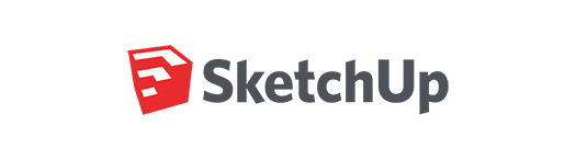
We decided it was best to stick to a single color. But which one? SketchUp's hue has shifted slightly over the years, but it's always been a flavor of red. As we looked at ruby and garnet, crimson and cadmium, burgundy and brick, we kept coming back to a desire for SketchUp's red to be as simple and positive as the rest of our brand. Our choice, Pantone 1795, is saturated, definitely not brown or purple, and stop-sign-visible at a thousand paces. I cheer up whenever I see it.

We chose a typeface called Whitney for the word "SketchUp". On the Comic Sans-to-Baskerville continuum of font gravitas, Whitney is friendly, professional and clean. Just like us, we think. To uniquify things a bit, we tweaked the ascenders and descenders to match the angles in our symbol. Setting them next to each other, we have the makings of the world's greatest t-shirt:
For the rest of the SketchUp Pro family of applications, we derived icons from the SketchUp symbol. LayOut is represented by an orthographic top view of the stair-step shape. Style Builder is an outline of the mark, rendered with stylized edges. All three icons are SketchUp Red, which ties them together and sets them apart.
Some of you are probably wondering why we didn’t just wait until SketchUp 9 to change this stuff. The answer is actually pretty simple. With the deadline looming on purging the old Google SketchUp logo from our product, we had three choices: lop off the first word and hobble along without a real graphic identity; come up with an interim solution; or go through the difficult but worthwhile process of solving the problem once and for all. The first option was totally unsatisfying, the second caused more issues than it solved, and the third offered us the opportunity to make a fresh start. It was an easy decision.

- Sponsored Plugins

- Sponsored Plugins

- Cover Story
-
 SketchUp Can Help You Win Interior..
 -
Best Laptops for SketchUp
-
How to Resize Textures and Materials..
-
Discovering SketchUp 2020
-
Line Rendering with SketchUp and VRay
-
Pushing The Boundary with architectural
-
Trimble Visiting Professionals Program
-
Diagonal Tile Planning in SketchUp
-
Highlights of some amazing 3D Printed
-
Review of a new SketchUp Guide
- Sketchup Resources
-
SKP for iphone/ipad
-
SKP for terrain modeling
-
Pool Water In Vray Sketchup
-
Rendering Optimization In Vray Sketchup
-
Background Modification In sketchup
-
Grass Making with sketchup fur plugin
-
Landscape designing in Sketchup
-
Apply styles with sketchup
-
Bedroom Making with sketchup
-
Review of Rendering Software
-
Enhancing rendering for 3d modeling
-
The combination of sketchup
-
Exterior Night Scene rendering with vray