Enhance your design skill with Sketchup and Photoshop
Debarati Nath
Photoshop is a powerful application on its own merits. Its power, however, can be significantly increased by using it in tandem with another application like Illustrator, Cinema 4D, or in this case, Google SketchUp. Today, we will create some cool 3D text using this free architectural application.
To create a daytime rendering by exporting images from SketchUp to Photoshop is a wonderful trick. This means no external rendering programs are needed. This rendering is not meant to be realistic, but instead, provide an option for quick artistic renderings without the "SketchUp" look.
It explores the idea of Ambient Occlusion shading to easily and quickly add realism to SketchUp images via Photoshop. This is done without ever using a rendering engine such as MAX or VRAY. The idea behind Ambient Occlusion is basically a really fast way of adding realism to a rendering by adding shadows in corners where geometry meets. You will often see me adding this affect in a lot of the videos may be created using the BURN tool in Photoshop. This video demonstrates how easy it is to get a really cool effect using just images exported from SketchUp, and a few tools from Photoshop.
If any of you have watched the Kerkythea clay model tutorial, you will notice that you get a similar look. The rendering engine is doing all of the work for you. The idea behind this new video is to show the power of the BURN tool in Photoshop, and how it can be applied to architectural illustrations. If there isn’t a lot of complex geometry in the image (in my case an aerial view of my design) than this method serves as an option to bypass using a rendering engine such as Kerkythea altogether and still get a really nice looking final result. Also, if your final illustration is looking a little flat, its an easy way to add a little punch to it.
Now we can have a discussion on how to merge SketchUp with Photoshop:
It explores the idea of Ambient Occlusion shading to easily and quickly add realism to SketchUp images via Photoshop. This is done without ever using a rendering engine such as MAX or VRAY. The idea behind Ambient Occlusion is basically a really fast way of adding realism to a rendering by adding shadows in corners where geometry meets. You will often see me adding this affect in a lot of the videos I created using the BURN tool in Photoshop. This video demonstrates how easy it is to get a really cool effect using just images exported from SketchUp, and a few tools from Photoshop.
If any of you have watched my Kerkythea clay model tutorial, you will notice that you get a similar look. The rendering engine is doing all of the work for you. The idea behind this new video is to show the power of the BURN tool in Photoshop, and how it can be applied to architectural illustrations. If there isn’t a lot of complex geometry in the image than this method serves as an option to bypass using a rendering engine such as Kerkythea altogether and still get a really nice looking final result. Also, if your final illustration is looking a little flat, its an easy way to add a little punch to it.
As the title implies, this architecture illustration tutorial doesn't use a rendering engine. There are few other tutorials in the past that don't involve a rendering program, however this tutorial does things a little differently, and in less time. You will probably notice some similarities to the Ambient Occlusion tutorial which was posted a while back. After making the ambient occlusion tutorial that could take advantage of the export options of Sketchup, and use the line work of the model to generate the shading. Because of this, the process is extremely streamlined and can be done in minutes.
Here's how it works.
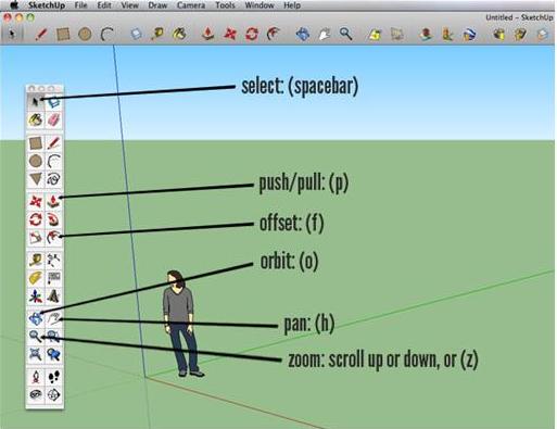
Begin by downloading the free version of Google Sketchup here. When you first open Sketchup, you’ll be prompted with a dialog box asking what style to begin with. I have chosen the simple style, with blue sky and green ‘grass’ (this is completely your preference, it will have no effect on your final outcome). Open the main tool box by clicking View > Tool Palettes > Large Tool Set. There are a few tools we’ll make a lot of use of, so it’s helpful to familiarize yourself with their shortcuts. These are the same on Windows and Mac: select: (spacebar), push/pull: (p), offset: (f), orbit: (o), pan: (h), zoom: scroll up or down, or (z)
Step 2
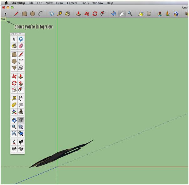
We need to create a template for where we’re putting our buildings. We’ll do this by viewing everything from the top. To view from the top, go to Camera > Standard Views > Top. You should see the word "Top" in the upper left corner after you do this. You’ll want your red and green axes pretty close, so zoom in if necessary to get to a nice position (below). To grab the screen, use the pan tool (h) to help line everything up.
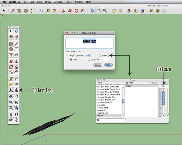
Next, click on the 3D text tool and type in your text. Click on "Fonts" to change your font (thick stroked bolder fonts work best), and input a size of 10" or greater. Then click "Place"
Now, click where you’d like to put your text on your canvas. If you want to move it after you place it, make sure it’s selected (spacebar) + click, then click the move tool (m) and drag to the new location. If you’d like to make your text bigger, make sure it’s selected (spacebar) + click, then click the scale tool (s), grab a green node (a corner one to scale proportionally, they’ll turn red once selected), and drag until you’re happy.
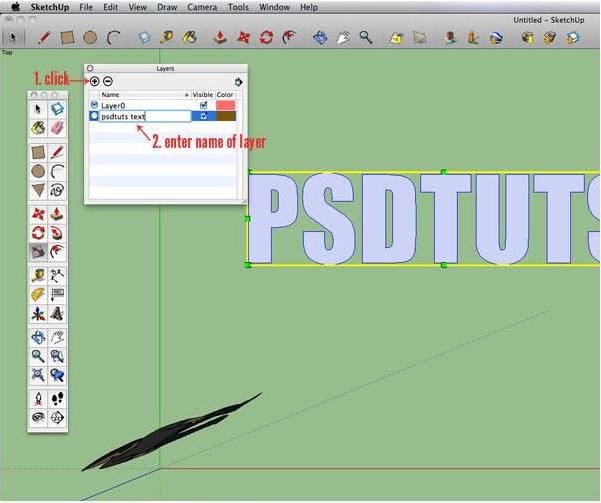
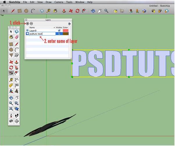
Now we need to put this on a separate layer. Unfortunately, this is a multi-step task, but a very easy one. We need to start by opening our layers palette. Go to Window > Layers. Once the layers palette is open, click the little "+" sign in the top left corner and name the new layer.
Next, with your selection tool (spacebar), right click on your text and choose "Entity Info." A small dialog box will appear with a layer drop down menu. From this menu, choose the new layer you just named in Step 5.
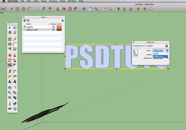
Your text has been officially moved. Feel free to close your "Entity Info" box, and if you wish, you can check to make sure you put your text on the new layer by unclicking the little checkbox under "Visible" in your layers palette. To be sure we put everything else on a different layer, make sure the radial button in the layers palette near "Layer 0" is highlighted (the same as the image above). Now, time to get to business!
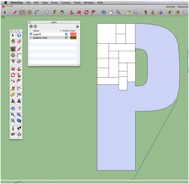
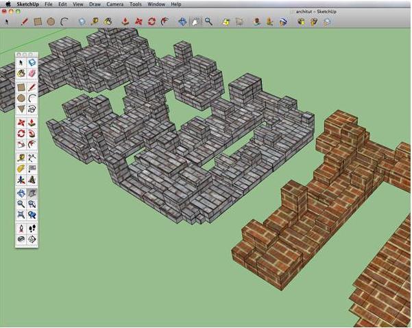
Select your rectangle tool (r), and zoom in nice and close to your first letter. Begin drawing squares and rectangles to fill up your first letter. If you make a mistake, don’t worry. Cmd/Ctrl + Z will undo multiple steps in the history. You can also select any rectangle and just hit your backspace or delete key to get rid of it. Try your best each time you draw a new rectangle to share an edge with the previous one so there are no gaps between your rectangles. Don’t forget you can make your template text visible and invisible as you go to see your progress (in your layers palette, checkbox under "Visible"). Use the pan tool (h) to grab the screen and move to the next letter. Do this for all of your letters.
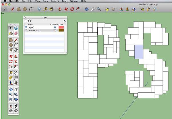
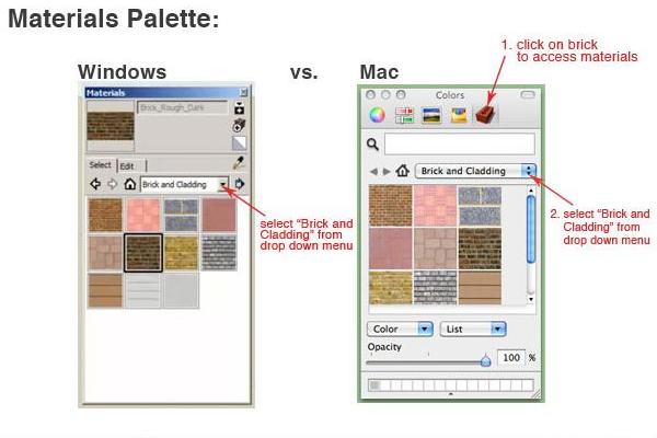
Viola! All rectangled out! Go to your layers palette and make your template text invisible by unchecking the "Visible" box beside it. Fill in any gaps you might have missed or delete any excess. Now it’s time to texture. Go to Window > Materials to open the materials palette.
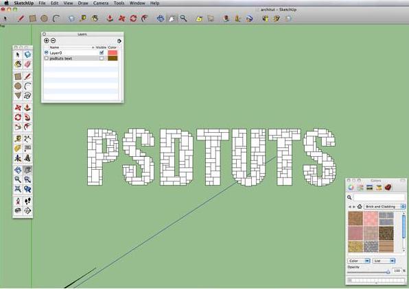
In your materials palette, choose "Brick and Cladding" from the drop down menu, then click on the material you’d like to use for your buildings.
With your selection tool (spacebar) rubber band to select the area you’d like to texture with your chosen material.
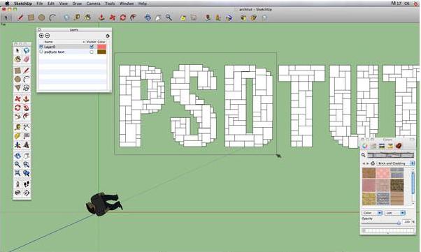
Next, grab your paint bucket tool (b) and click on any of the squares that are selected. The entire selection will now be textured. If you are unhappy with the size of the texture, rubber band select all of your letters, then use the scale tool (s), grab a corner green node (to scale proportionally), and resize until you are happy with the size of the texture within your squares.
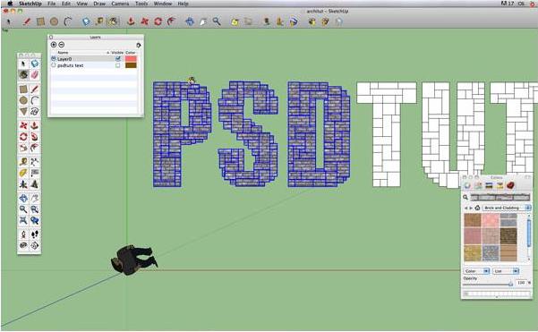
Texture the rest of your squares. You can also texture each square individually, if you’d like to put a mixture of different textures together.
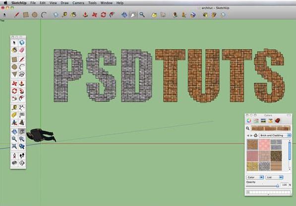
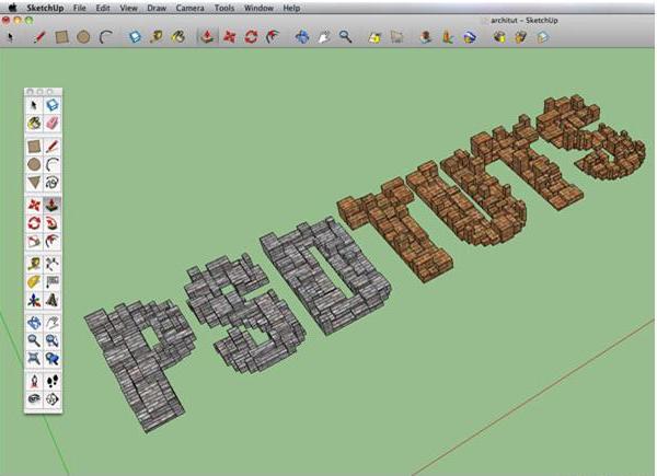
Now for the fun part! Grab your orbit tool (o) and orbit to an angle similar to the one below.
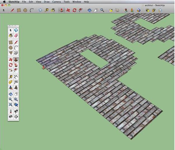
Next, grab your push/pull tool (p) and place it over one of your squares until it highlights. Click, then drag upwards until you are happy with the height. Click to deselect. Move to the next square and repeat the process.
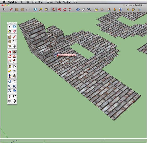
TIP: When you pull next to a previously pulled segment and you attempt to pull higher than it, you’ll receive an "Offset limitied to" red box (below). To continue pulling, click to end the segment, then click again to raise it higher.
Keep pulling until you’re happy with your mini city of letters. Use your orbit tool (o), pan tool (h), and zoom to scroll up and down, or (z), to navigate through and around all of your letters.
Once you have all of your letters pulled, it’s time to change up a few roofs to add a little visual interest and detail. We’ll do this by using the offset tool (f). Zoom in closely to your first letter, grab your offset tool, and get close to the edge of the roof you would like to adjust. Once on the edge, click and move the offset tool inward, towards the center of the top of the building. You’ll notice new edges, forming what looks like a border. Release the tool by unclicking when you are satisfied by the width.
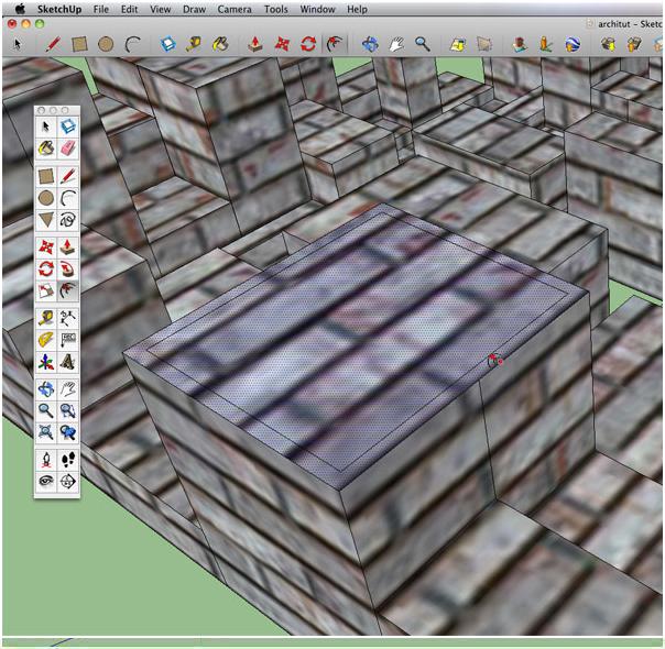
Now, grab your push/pull tool (p) and once the center of the newly formed border is highlighted in blue, push downward to create a rooftop. Repeat these steps to random building tops on all of your letters.
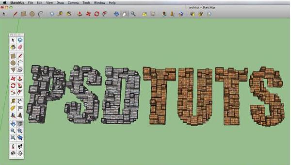
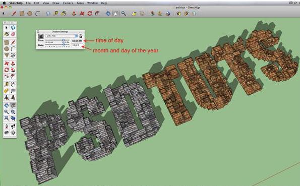
Time to add some shadows! To add shadows, go to View > Shadows. Orbit around to get an idea of the angle you’ll want for your final composition. Not the look of the shadows for the time of year you want? No need to worry – that’s what the Shadows Palette is for. To open it, go to Window > Shadows. Once opened, input the precise date and time, or use the sliders to preview your shadows.
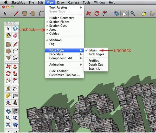
Now we need to get this ready for export. To make things look a little more finalized, we’ll need to hide our axes and edges. To do this, go to View > Axes and uncheck it. To uncheck your edges go to View > Edge Style > Edges.
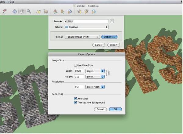
That looks better. Get your text positioned exactly how you want it to look, making sure the entire piece fits on your screen. When you’re satisfied, go to File > Export > 2D Graphic. A dialog box shows up, and you have 3 options to choose from: jpeg, png, and tiff files. I’ve selected a tiff file. If you click "Options…" a second box shows up where you can specify exact dimensions and resolution, as well as rendering options. I’ve chosen the settings below for mine. The width and height are the default screen size, which is why making sure your entire piece fits on your screen is important. For whatever reason, even if you put in a resolution other than 72ppi, it will still open as 72ppi. Luckily, it’ll be large enough where you can adjust it in Photoshop when you scale it down. When you’re ready, Export away. Time to take it into Photoshop!
Now that we’re in Photoshop, open your 2D graphic file from where you saved it. Next, let’s get our canvas a little easier to work with. To change the canvas size, go to Image > Canvas Size and add a bit more height, then crop (c) at the resolution you prefer (mine’s at 150ppi). Name your layer Original.
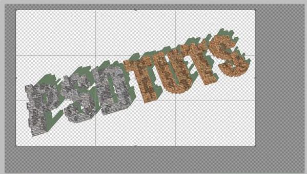
Let’s take care of those horrible green shadows. Select them using your magic wand tool (w) and shift-click to add each additional piece. Now that they’re all selected, go to Select > Modify > Expand. Input 1px and hit Ok.
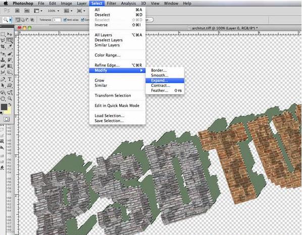
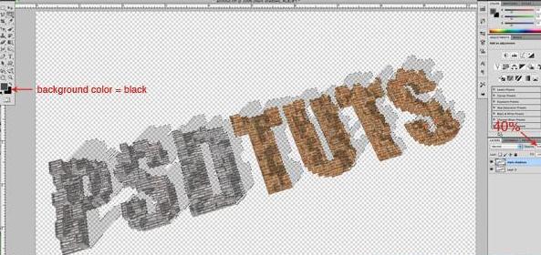
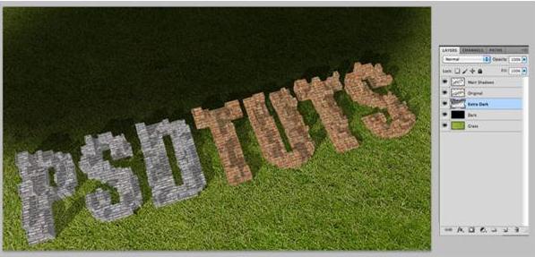
Now hit Delete or Backspace to remove the green shadows from the original image. Keeping your selection, create a new layer and call it Main Shadows. Make your background color black, then hit Cmd/Ctrl + Backspace to fill the selection with black. Set this layer’s opacity to 40%.
Now we need to bring in a background. I’ve used a grass texture which you can get here. Place the image in a layer below Original and name it Grass.
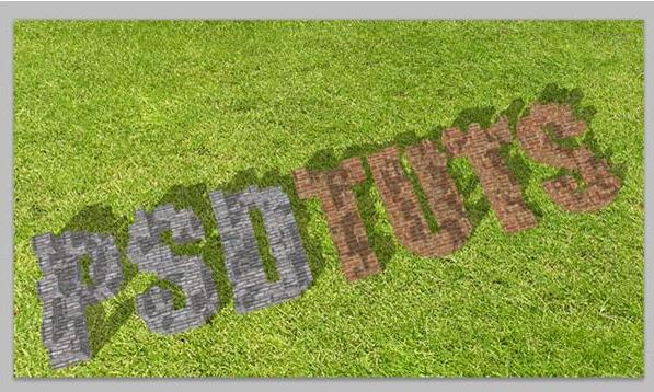
It’s pretty obvious our grass needs some darkening up here. Create another layer right on top of it, fill it with black, and name it Dark. Set this layer’s opacity to 35%.
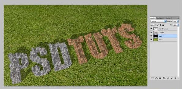
Following the direction of the shadows off of the text, and to make the focal point more concentrated on the text, create a new layer above Dark. Create additional shading to the grass just above the text using a large soft brush. Name this layer Extra Dark and set the opacity to 25%.
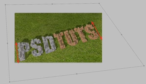
To get the grass following the same perspective as our letters, we need to distort it. Cmd/Ctrl + T to free transform your grass, right click, and choose Distort. Grab the corner nodes to follow the angles of the first and last letters for each side.
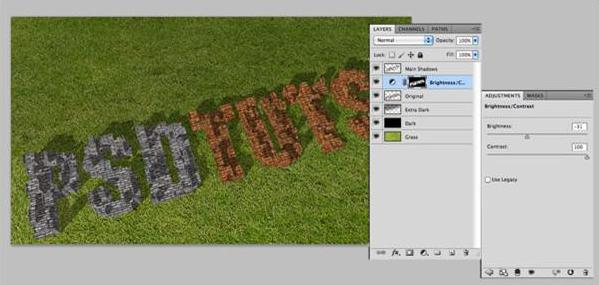
Now to juice up these letters! Cmd/Ctrl-click the Original’s layer thumbnail to select its content. Create a brightness and contrast adjustment layer, setting brightness to -31, and contrast to 100.
Now we need to add a couple of layer styles to the Original layer. Double click the layer, and check Drop Shadow. Add the settings below. I’ve turned off global light and chosen an angle to make the drop shadow match the Original’s shadows, so choose an angle for your own that will best match up with yours.
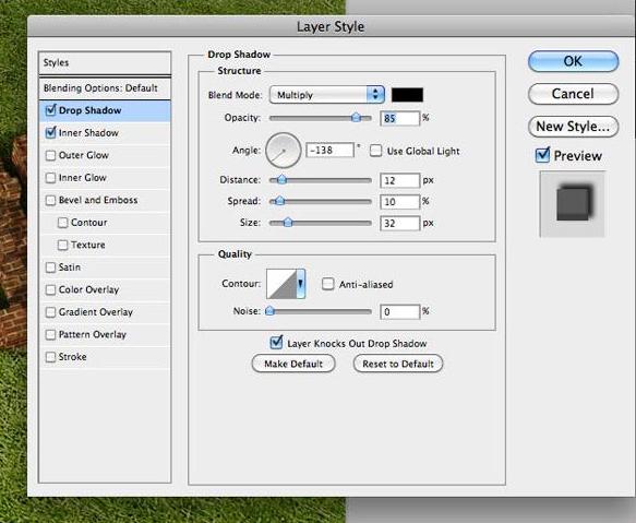
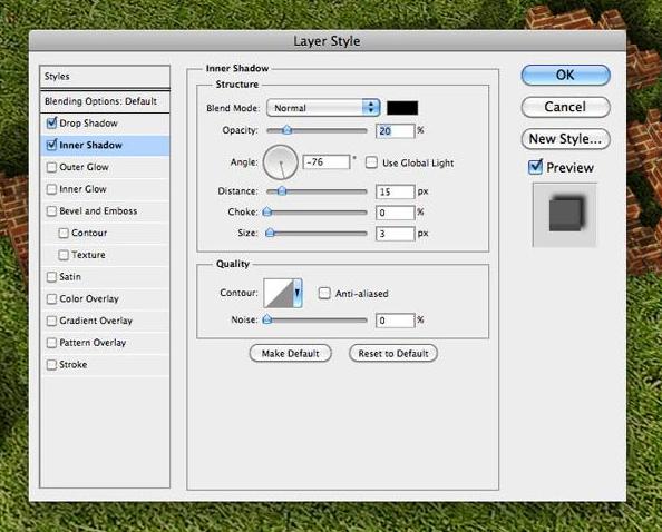
Next, check Inner Shadow. We’re just going to add a very, very subtle shadow that will be apparent on the bottom edges of all the letters just to give it a little extra depth. Add the settings below, but adjust the angle for your own piece to match that bottom edge.
Next, crop your image for your final composition or look.
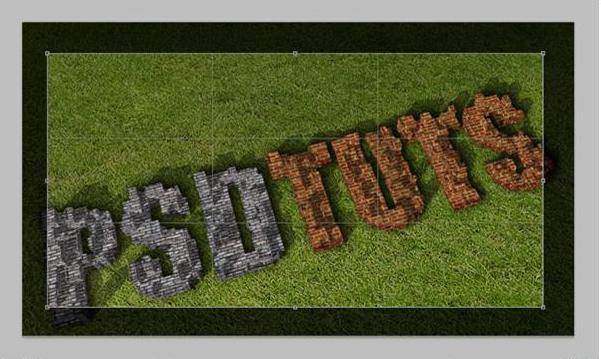
Create a new layer at the very top and with a soft brush, lightly shade the outer edges and corners for a final touch. Google Sketchup is a great alternative to the Repousse tool, especially if you don’t have CS5, and there are plenty of video tutorials on Youtube for learning new features. Thanks for reading!


- Sponsored Plugins

- Cover Story
-
 SketchUp Can Help You Win Interior..
 -
Best Laptops for SketchUp
-
How to Resize Textures and Materials..
-
Discovering SketchUp 2020
-
Line Rendering with SketchUp and VRay
-
Pushing The Boundary with architectural
-
Trimble Visiting Professionals Program
-
Diagonal Tile Planning in SketchUp
-
Highlights of some amazing 3D Printed
-
Review of a new SketchUp Guide
- Sketchup Resources
-
SKP for iphone/ipad
-
SKP for terrain modeling
-
Pool Water In Vray Sketchup
-
Rendering Optimization In Vray Sketchup
-
Background Modification In sketchup
-
Grass Making with sketchup fur plugin
-
Landscape designing in Sketchup
-
Apply styles with sketchup
-
Bedroom Making with sketchup
-
Review of Rendering Software
-
Enhancing rendering for 3d modeling
-
The combination of sketchup
-
Exterior Night Scene rendering with vray